App Design for Solar Farm Software
BEFORE… AFTER… Intro
Sunfarmer was an internal tool which was used by solar engineers around the world. These engineers used this software to plan, calculate and design large solar farms. The software was complex, as it had to account for a wide range of variables such as:
The angle of the sun
The height and angle of panels
Obstacles
Calculations
These were just some of the considerations which needed to be taken into account in order to ensure the designs were as accurate as possible.
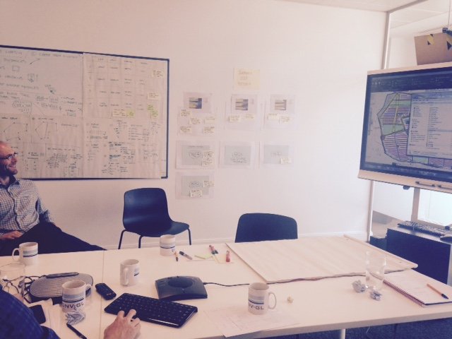
Software during a user testing session.
User testing
We had wireframe designs in place already and wanted to test its’ ease of use and collate feedback on user behaviour and identify any sticking points. I led a series of remote user tests with 4 solar engineers in different locations.
Prior to the test I had prepared a series of questions, and user test guidelines to cover during the session. During the user test, I asked participants to share their screen and talk me through their process, step by step.
-
When user testing, I’m always conscientious not to lead the participant in order to aid more accurate and quality results.
The user works their way down the left navigation in order to place their calculations into each part of the process.
On the whole users found the product intuitive and a useful tool. We learnt that users had previously been spending long periods of time drawing out every single solar panel, individually. Sometimes there were hundreds of panels which they would need to lay out on their designs. Their process for completing this task was time consuming and laborious. So, this tool was the first step in aiding them with their workload.
When asked what one thing was the most important to improve, the response was,
“The layout section, as this is not as intuitive as the rest”
The tool bar that was being used during testing.
Interview findings
We discovered that their biggest challenge was specifically around the tool bar itself.
Although the basic tools had been designed as part of the first release, there wasn’t enough detail within this section for them to complete their task. Their task in this section was to be able to draw, and design their solar farms.
So we ran a workshop to understand and identify what tools were actually needed.
We had solar engineers from around the world to attend remotely so the team could understand the use of their tools.
There were so many tools needed, that I conducted a prioritisation task in order to separate out the tools into logical hierarchies.
Through the findings of the workshops and user testing, these were all the tasks that I identified.
Key finding…
At this stage, I knew which tools were available and which were missing. From the interviews, I learnt that the tools needed to be available at all times. After understanding their real workflow, there was no particular order in which they were used, since they needed to go back and forth whilst using them.
My process of sketching out numerous toolbar layout ideas:
Prototyping
The original design…
The tool bar at the top was unreliable, and didn’t provide enough accuracy.
I designed the new layout for ease of use with the following in mind:
My re-design…
Increased control for the engineers to be able to design their solar farms with increased accuracy
A simple step by step process to ensure nothing was missed
A tool library which needed to be easily accessible for them at any point during their design process.


